Theme Features

This theme is built on the Warp framework, a well-engineered theme framework for WordPress and Joomla, and utilizes all of its latest features. The user interface is powered by UIkit, a lightweight and modular front-end framework, which provides the theme's styling. The theme also comes with a wide range of different
layouts and widget variations.

Styles

6 different theme styles for a good start.

We provide lovingly crafted style variations to give you a glimpse of what is possible with this theme. The built-in theme customizer allows you to modify colors, fonts, sizes and much more without any CSS knowledge. Just choose your colors with the color picker and adjust the theme with only a few clicks. Click on one of the images to see the style.

Default
California
Forest
Dark
Snow
Workspace

Custom Widgets

Finch is featuring 3 new Widgetkit widgets
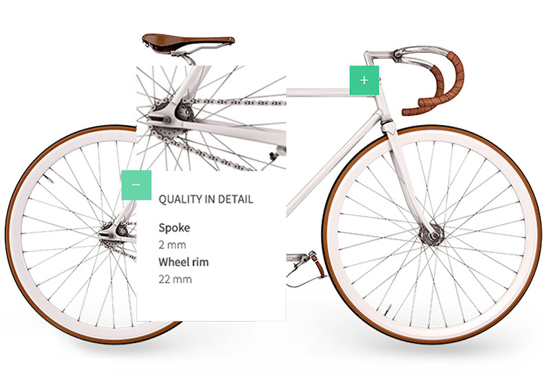
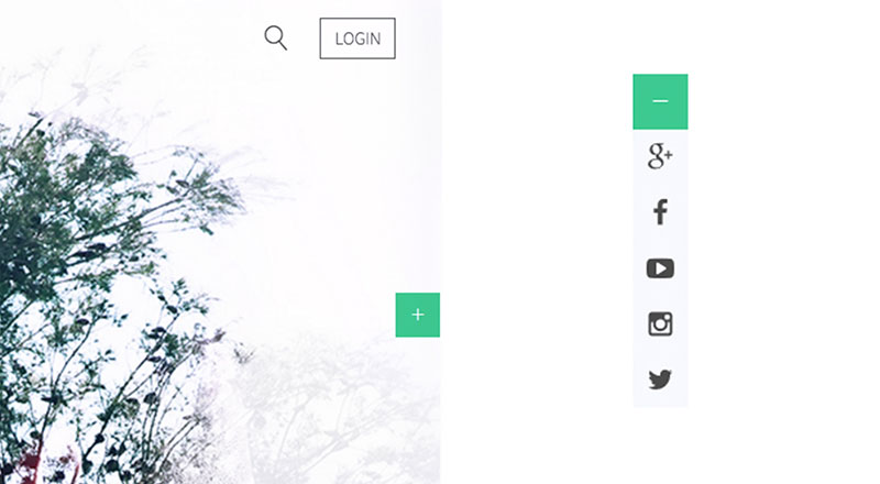
Popover

Popover

In the special Popover Widget each item can be positioned through coordinates on top of a main image, which is chosen in the widget settings, and display content inside a dropdown.
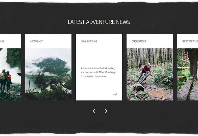
Slider

Slider

The custom Slider widget displays the item’s title above the media and displays content on hover. In addition to the default Slider options you can apply a custom arrow icon for the link.
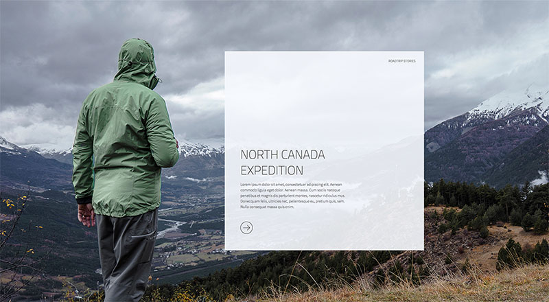
Slideshow

Slideshow

Finch theme features a custom Slideshow widget, which incorporates the navigation into your content. Of course, all other Slideshow features are still included.

Theme Features

Finch is featuring brand new and advanced Warp options.

Block Appearance

Block Appearance

Finch Theme offers a number of different options to enhance the appearance of each widget/module position. You can add different background colors, paddings and textures, including grungy borders to every block.
Background Text

Background Text

This theme provides the option to add a background image or gradient to text, so that the words will clip the background itself. Just add the .tm-text-clip class and the background image via inline style to your text element.
<h3 class="tm-text-clip" style="background-image: -webkit-linear-gradient(transparent, transparent), url('my-image.jpg');">...</h3>
Panel Options

Panel Options

The Warp administration adds a number of options to modules/widgets. Each can be aligned to the left, right or center. You can set different opacities and badge can be aligned to the top or bottom.
Socialbar

Socialbar

Finch provides an additional Socialbar Position. The toggle button sticks to the side of the browser window and displays the social icons on click. For the different button classes check the table below.

Custom Classes

Finch includes a number of custom classes that extend the functionality of UIkit and Warp or help customize the styling of certain Widgetkit plugins. This table gives you an overview of the purpose of each of these classes.

Class Description
.tm-large-padding This class adds more padding to block elements.
.tm-text-clip Add this class to text with a background image, so that the image will be clipped by the text.
.tm-panel-height Adds a min-height of 820px to block elements.
.tm-icon-google-plus .tm-icon-facebook
.tm-icon-youtube-play .tm-icon-instagram
.tm-icon-twitter
These classes apply the appropriate corporate color to each social icon button.

Warp Framework

A fast and slick theme framework which is built on the latest web techniques like HTML5, CSS3 and PHP 5.3+

Visit Website

UIkit

A lightweight and modular front-end framework for developing fast and powerful web interfaces.

Visit Website